Results 1 to 17 of 17
  1. #1

    Default NEW PCTA logo is/was an issue?

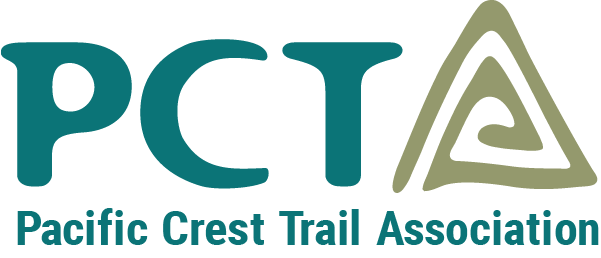
    Yesterday I received an email saying that this would be the new logo for the PCTA:

    Today I got another email stating that after the image was posted "several members alerted us to a serious issue with our new logo." It's now been axed and they are back to the original logo. Just wondering.....anyone know why this logo was an issue?

  2. #2
    Registered User
    Join Date
    09-14-2013
    Location
    Nunna Yerbiz
    Age
    62
    Posts
    205

    Default

    Someone on the PCT-L posted a Reddit link showing the triangular spiral looked like a pedophile symbol.

  3. #3
    Registered User
    Join Date
    05-02-2014
    Location
    St. Louis, MO
    Posts
    1,264

    Default

    Quote Originally Posted by LuckyMan View Post
    Someone on the PCT-L posted a Reddit link showing the triangular spiral looked like a pedophile symbol.
    Looked like? OMG, you need to see it. It doesn't "look like" it....OMG.......LMAO...bet this is the LAST time they use THAT ad agency!!!

    https://wikileaks.org/wiki/FBI_pedophile_symbols

  4. #4
    Registered User
    Join Date
    01-16-2011
    Location
    On the trail
    Posts
    3,789
    Images
    3

    Default

    Glad they reversed, that new logo was hideously ugly.
    enemy of unnecessary but innovative trail invention gadgetry

  5. #5
    Registered User
    Join Date
    03-25-2014
    Location
    Westchester County, NY
    Posts
    2,305

    Default

    Almost as bad as those darn Buddhists using a swastika!

  6. #6
    Registered User
    Join Date
    05-14-2016
    Location
    West-central Indiana
    Posts
    419

    Default

    I wonder if someone at the ad agency tried to pull a quick one.

  7. #7
    Registered User DownEaster's Avatar
    Join Date
    03-15-2017
    Location
    Silicon Valley
    Age
    68
    Posts
    682

    Default

    Quote Originally Posted by jgillam View Post
    I wonder if someone at the ad agency tried to pull a quick one.
    Likely only to the extent that they didn't bother to conduct a proper trademark/intellectual property search. They probably figured that if they spent half an hour scribbling on a white board, their creation just had to be unique.

  8. #8

    Default

    Didn't know what the issue was. Thanks for clarifying it for us. My first reaction to the new logo was, I hope they didn't waste money paying for it; money better spent on the trail. Having been at companies that rebranded themselves saying it would speak better to the customer, I can say it never makes a difference. But if it was an internal thing with no money paid, then no big deal.

  9. #9
    Registered User
    Join Date
    02-01-2017
    Location
    Pietermaritzburg, South Africa
    Age
    65
    Posts
    469

    Default

    Logo designs are always contentious. Being subjective in nature everyone considers their 10 cents worth to have merit. My 10 cents worth is that the two logos in question are miles apart. I see mountains and the letter A.

  10. #10
    Registered User
    Join Date
    02-01-2017
    Location
    Pietermaritzburg, South Africa
    Age
    65
    Posts
    469

    Default

    There must be a few hundred triangular shapes out there.

    Quicash.jpg

  11. #11
    Registered User
    Join Date
    07-25-2015
    Location
    Sugar Hill, GA
    Age
    57
    Posts
    920

    Default

    They should just have a contest and let some designers come up with one.

  12. #12
    Getting out as much as I can..which is never enough. :) Mags's Avatar
    Join Date
    03-15-2004
    Location
    Colorado Plateau
    Age
    49
    Posts
    11,002

    Default

    Quote Originally Posted by cmoulder View Post
    Almost as bad as those darn Buddhists using a swastika!
    NAtive American too.

    My Grandfather's division in WW2 was the 45th. AKA The Thunderbirds. They originally had a native American "rolling log" patch aka the swastika. You can see why it was switched. :O

    I saw an original division patch in a museum. And I was "Yep, I see why it was switched!"

    https://en.wikipedia.org/wiki/45th_I...United_States)
    Last edited by Mags; 07-26-2017 at 13:06.
    Paul "Mags" Magnanti
    http://pmags.com
    Twitter: @pmagsco
    Facebook: pmagsblog

    The true harvest of my life is intangible...a little stardust caught,a portion of the rainbow I have clutched -Thoreau

  13. #13

    Default

    Symbolic of the insignia on Lemurinan inter dimensional spacecraft that have been known to dematerialize as they exit and enter their Earth base at Mt Shasta.

    As fictional symbologist Professor Richard Langdon said "what really matters is what you believe." Maybe, the current publicized hot topic belief is that it's a pedophile symbol. Whole topic of pedophilism seems greatly exaggerated through fear mongering.

  14. #14
    Registered User
    Join Date
    02-01-2017
    Location
    Pietermaritzburg, South Africa
    Age
    65
    Posts
    469

    Default

    If the brief was to include a mountain, it's pretty hard not to do a triangular shape of some sort

  15. #15
    GSMNP 900 Miler
    Join Date
    02-25-2007
    Location
    Birmingham, AL
    Age
    57
    Posts
    4,864
    Journal Entries
    1
    Images
    5

    Default

    Quote Originally Posted by TTT View Post
    If the brief was to include a mountain, it's pretty hard not to do a triangular shape of some sort
    But the problem here is that the PCTA triangle above and the FBI listed symbols on the linked website are identical symbols.
    Both could be described as "six lines drawn in a spiral pattern forming the outline of an equilateral triangle, with the spiral opened at the bottom-left corner".
    The only difference is that the PCTA spiral is clockwise, where as the FBI listed spiral is counter-clockwise.

    That would be like someone trying to adopt a counter-clockwise swastika as their symbol (the Nazi swastika was a clockwise design). Most people wouldn't pay attention to the clockwise v counter-clockwise and still call it a Nazi symbol.

    By contrast, the triangle shown above for QUICASH is "ten lines drawn in a spiral pattern forming the outline of an equilateral triangle, with the spiral opened at the top ending with an arrow pointing up and to the right". That makes for a symbol that is visually distinct from the PCTA/FBI triangle. The outline is distinctly different, and consists of twice as many pen strokes (10 lines for the triangle plus 2 more lines for the arrow).

  16. #16

    Default

    I personally think it's visually and astetically...unappealing, it dosen't Pop!

  17. #17
    Wanna-be hiker trash
    Join Date
    03-05-2010
    Location
    Connecticut
    Age
    42
    Posts
    6,922
    Images
    78

    Default

    Quote Originally Posted by rocketsocks View Post
    I personally think it's visually and astetically...unappealing, it dosen't Pop!
    Seriously.

    Their old logo looks much better.
    Colorless green ideas sleep furiously.

++ New Posts ++

Posting Permissions

  • You may not post new threads
  • You may not post replies
  • You may not post attachments
  • You may not edit your posts
  •